By adjusting colors, chart size, and line width, you can make brew curves easier to read, more comfortable to view, and better suited to your personal browsing habits.
Steps:
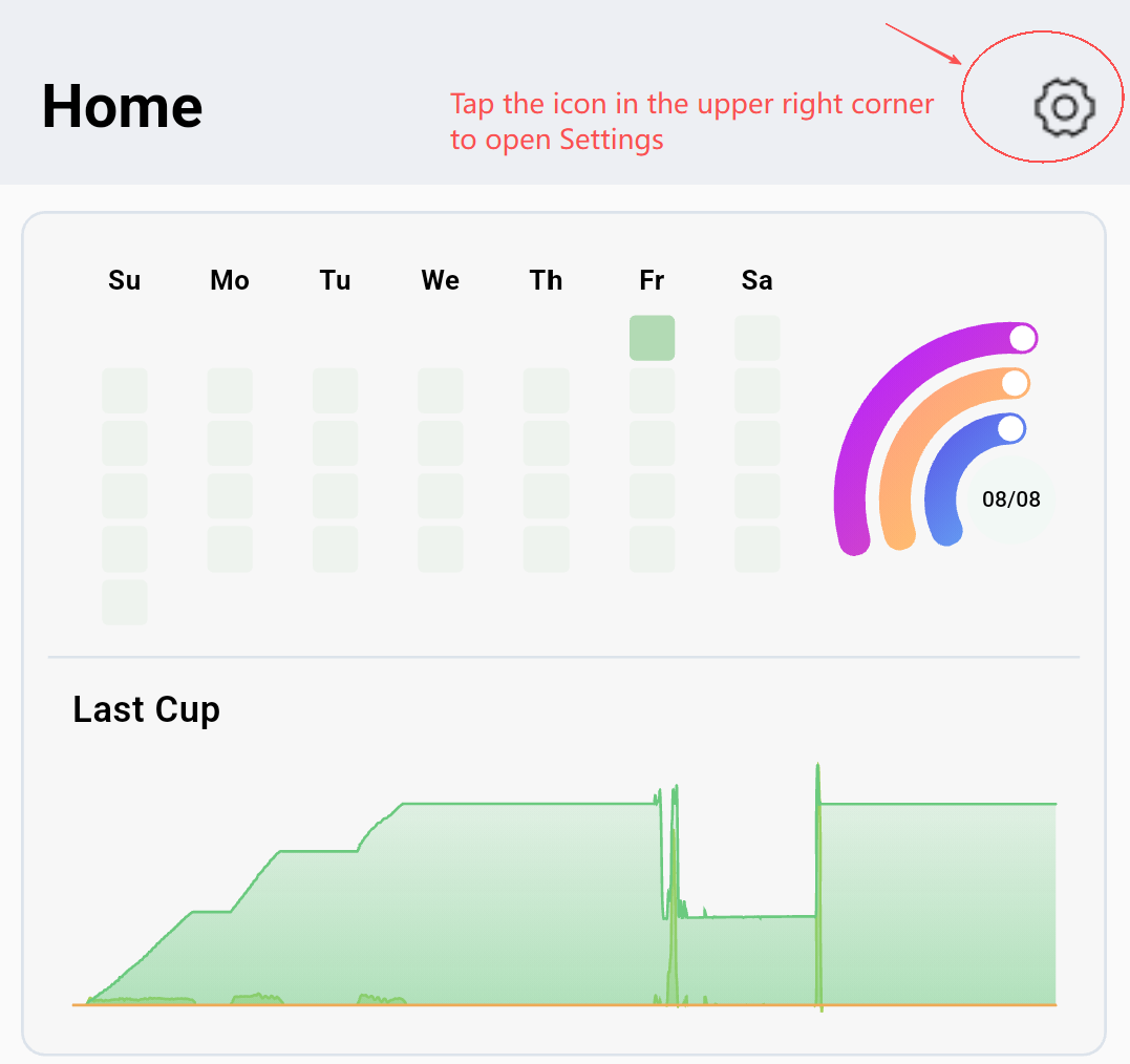
1. Open the Settings Page
On the Home page, tap the gear icon in the top-right corner to enter the Settings menu.
2. Go to Chart Settings
Inside Settings, you’ll see multiple configuration sections, including:
Basic Settings
Chart Settings
Data Quality Mode
Language Settings
Theme Settings
Version Settings
Visualizer Settings
Privacy Settings
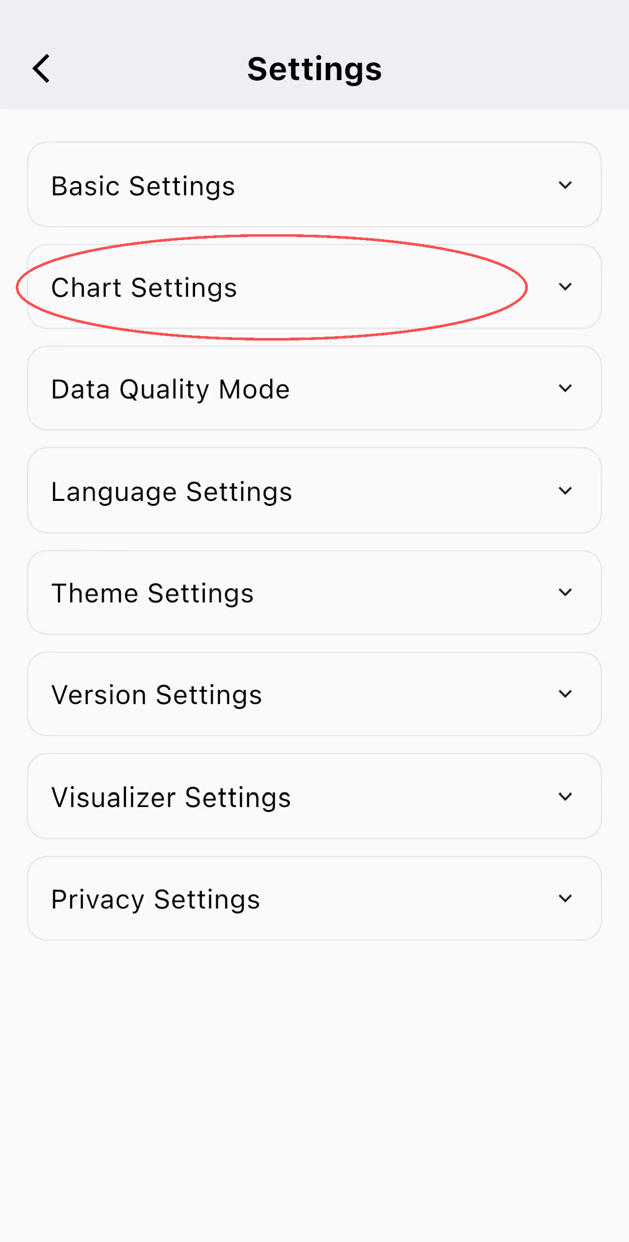
Tap Chart Settings to customize how brew curves are displayed.
3. Adjust Brew Curve Visuals
Within Chart Settings, you can personalize:
Chart Size (Width & Height)
Curve Colors
Line Width
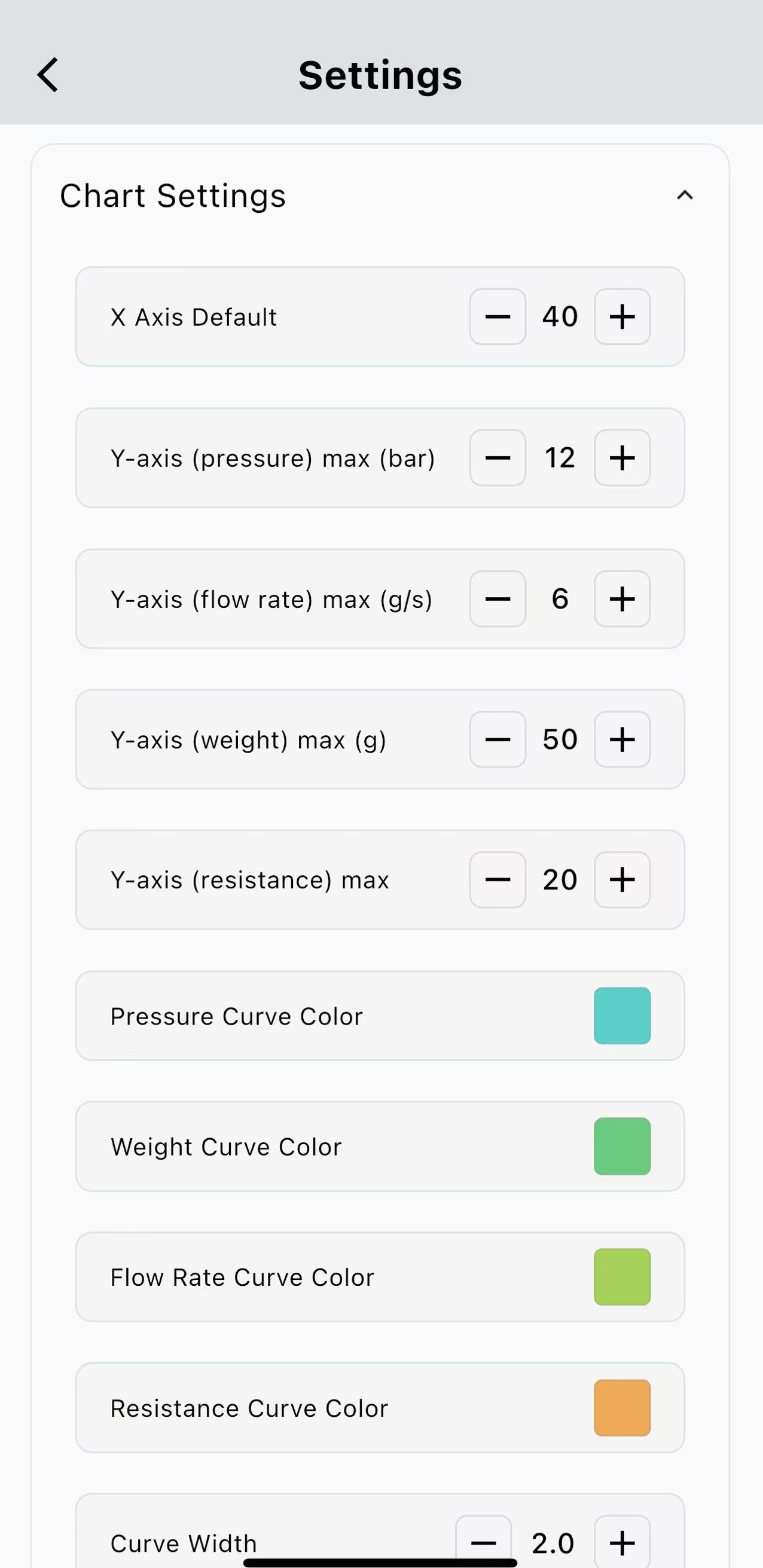
These changes affect only the visual presentation, helping you review and analyze brews more comfortably without altering any brewing data.